 Lily Lane Aesthetics
- Status
- LiveShipped and publicly available.
- Started
- Completed
- Role
- Web Design, Front-End Development, SEO Strategy, Information Architecture, Migration & Launch Coordination
- Built with
Overview
Lily Lane Aesthetics began as a focused website refresh and SEO expansion for a Houston medical-aesthetics practice.
The original brief was relatively contained: improve homepage search structure, create a dedicated Lily Lift page, expand treatment pages, add education content, and strengthen local SEO.
The project grew substantially.
I first explored the visual direction in custom HTML and CSS so the design could develop without being constrained by the existing Squarespace implementation. The client selected a lighter direction built around warm neutrals, gold accents, delicate florals, and softer editorial imagery.
As the treatment architecture expanded, the production approach changed too. What began as a Squarespace refresh evolved into a WordPress + Elementor rebuild that retained extensive custom HTML and CSS.
Luxury Presentation vs. Search Depth
The site needed to do two things that can easily work against each other: feel like a high-end aesthetics brand and contain enough specific treatment information to perform in local search.
I avoided forcing every keyword into the hero.
The most visible parts of each page remain relatively concise and editorial, while treatment detail, FAQs, internal links, service hierarchy, breadcrumbs, and structured data carry more of the search depth.
That let the site remain visually calm without reducing the amount of useful information available to users and search engines.
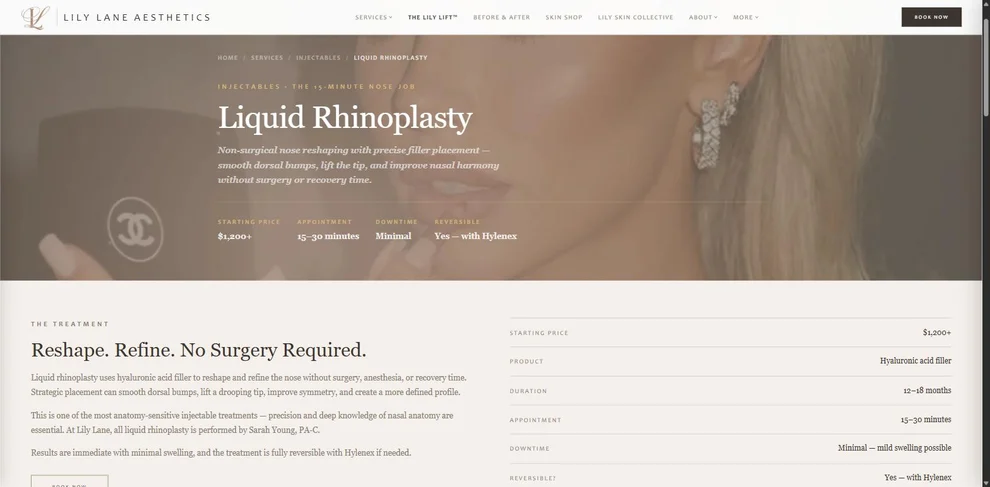
Designing Mobile First Because the Data Said So
The existing traffic mix changed the design priority.
Of 2,066 baseline monthly visits, 1,676 came from mobile devices — roughly 81%.
Responsive behavior therefore could not be treated as final polish. Hero heights, image crops, overlays, typography, and spacing were tuned specifically for narrow screens rather than simply allowing the desktop layout to collapse.
Client photography created an additional challenge because the source material ranged from wide landscape imagery to portrait-oriented photos. Instead of forcing every photo through one crop rule, I added separate hero behavior for standard and portrait media so the page structure could remain consistent while the image treatment changed intentionally.
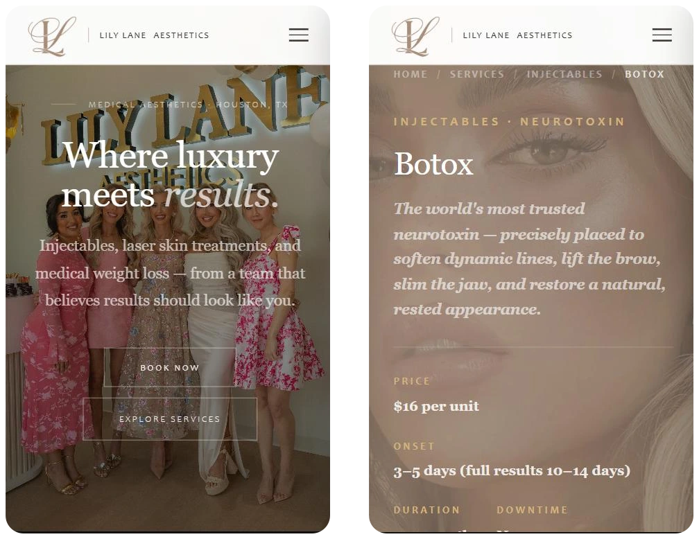
Growing Beyond the Original Platform
The project outgrew both the original scope and the original platform assumption.
A static prototype was no longer enough once the site expanded across injectables, lasers, microneedling, skincare, memberships, and diagnostic services. I created a WordPress staging environment and moved the custom visual system into Elementor-backed production pages rather than rebuilding everything as generic page-builder widgets.
Treatment pages use reusable hero structures, breadcrumbs, service metadata, and deeper educational content below. Schema and internal hierarchy connect parent services with individual treatments.
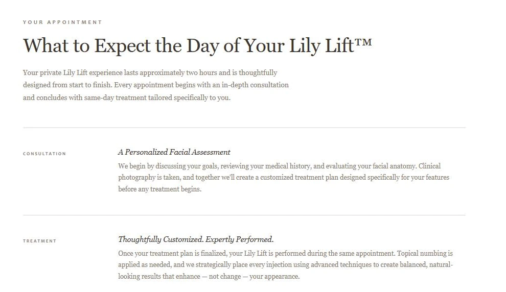
The engagement also expanded into staging, SSL, WordPress setup, migration planning, hosting/domain coordination, and launch review.
A Before & After Gallery the Client Never Has to Maintain
Before and after photography is the single most persuasive asset an aesthetics practice owns, and it is also the asset that goes stale fastest. Providers shoot results on their phones every week. Any workflow that ends with “log into WordPress, upload, crop, tag, publish” ends with a gallery that stopped growing a month after launch.
So the gallery is not maintained in WordPress at all. I wrote a small plugin that reads the practice’s own Google Drive.
The clinic already stored results the way they think about them: one folder per treatment. The plugin treats that folder tree as the source of truth. Each folder is matched to a treatment on the site by slug, so Lily Lift in Drive is the same entity as the Lily Lift treatment page, its label in the filter bar, and the treatment tag printed on every card. Photos are pulled through the Drive API on a schedule, resized and cached locally so the page never hotlinks Drive or waits on it, and the filter bar is generated from whichever treatment folders actually contain images. A folder with nothing in it does not produce an empty tab.
The result is that publishing a new result is dropping a photo in a folder on a phone. Nobody logs into WordPress, nobody resizes anything, and nobody can accidentally publish a photo into the wrong treatment — the folder it lives in decides that.
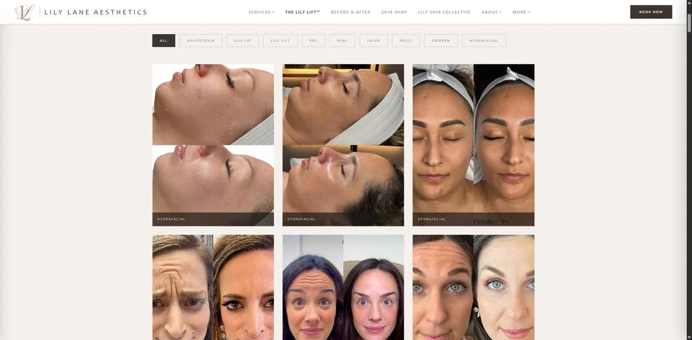
It also solved a governance problem quietly. Consent and curation stay where the clinic already manages them — in Drive, controlled by staff — rather than in a CMS account that has to be handed out to whoever is shooting that day.
Current State
The site launched on the production domain in August 2026 and is live at lilylaneaesthetics.com. It carries the full build: reusable treatment pages, responsive behavior, structured navigation, schema markup, and the selected visual system.
Post-launch SEO and conversion results are not yet established, so I treat those as open measurements rather than claimed outcomes.
The pre-redesign baseline is captured, which makes the next useful update to this case study data: establish a post-launch analytics window and compare it against that baseline.
Milestones
Visual concepts presented
Explored light and dark custom HTML/CSS directions before committing to production.
Production approach shifted to WordPress
Moved beyond the original Squarespace-refresh plan as the service architecture and design scope expanded.
Drive-backed before/after gallery shipped
Built a custom WordPress plugin that publishes results straight from the practice's Google Drive, matching treatment folders to treatments on the site.
Client launch approval
Reached launch-stage approval after extensive responsive, content, hero, and treatment-page refinement.
Launched
Went live on the production domain at lilylaneaesthetics.com.